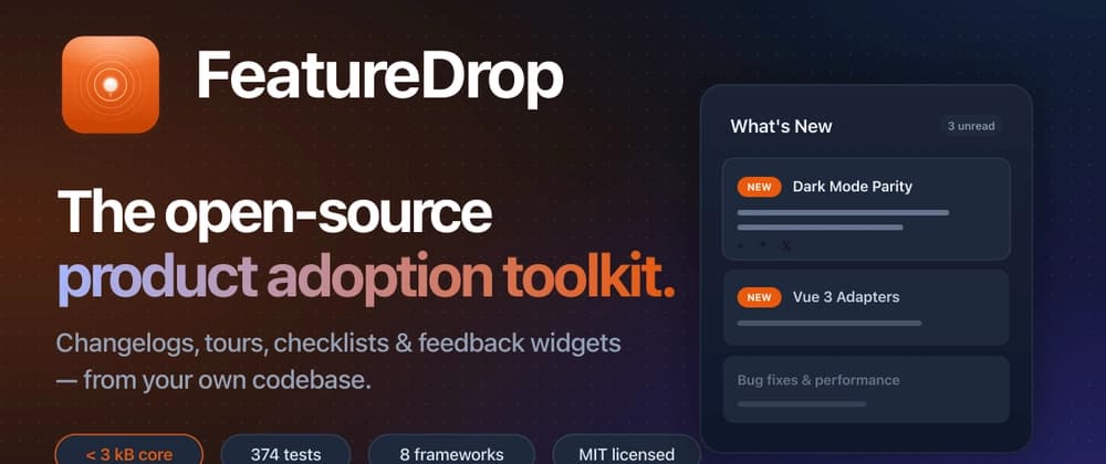
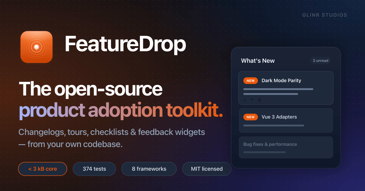
How I Replaced $3,000/Year of SaaS With 50 Lines of Code - Building FeatureDrop
I open-sourced a full product adoption toolkit — changelogs, tours, checklists, feedback widgets. Here's the code, architecture, and why it's < 3 kB.
title: "How I Replaced $3,000/Year of SaaS With 50 Lines of Code - Building FeatureDrop" published: true description: "I open-sourced a full product adoption toolkit — changelogs, tours, checklists, feedback widgets. Here's the code, architecture, and why it's < 3 kB." tags: react, opensource, webdev, javascript cover_image: https://featuredrop.dev/og/og.png canonical_url: https://featuredrop.dev series: "Building FeatureDrop"
How I Replaced $3,000/Year of SaaS With 50 Lines of Code
Every SaaS product eventually needs the same thing: a way to tell users about new features. A "New" badge. A changelog popup. A guided tour for complex flows.
The standard playbook is to buy a third-party tool, embed a script tag, and configure it through a dashboard. It works. But it also costs $50–600/month, ships 100–300 kB of JavaScript to your users, and locks your feature data in someone else's database.
I decided to see how much of that I could replace with a library.
The answer turned out to be: all of it.
The Core Insight
Product adoption tools are fundamentally simple at the data layer. Every one of them does the same thing:
features[] → isNew(featureId) → render UI
A list of features with dates and metadata. A function that checks whether a specific feature is "new" to the current user. And a set of UI components that react to that state.
The complexity lives in the vendor dashboard, the analytics pipeline, and the billing system — not in the client-side code. Strip all that away and you're left with something surprisingly small.
FeatureDrop in 50 Lines
Here's a complete product adoption setup — changelog, badges, and an onboarding tour:
// features.json
const features = [
  {
    id: 'dark-mode',
    label: 'Dark Mode',
    description: 'Full dark theme support across every surface.',
    releasedAt: '2026-02-20',
    showNewUntil: '2026-04-20',
    category: 'ui',
  },
  {
    id: 'csv-export',
    label: 'CSV Export',
    description: 'Export any report to CSV with one click.',
    releasedAt: '2026-02-25',
    category: 'data',
  }
]

// App.tsx
import {
  FeatureDropProvider,
  NewBadge,
  ChangelogWidget,
  Tour,
  Checklist,
} from 'featuredrop/react'

const tourSteps = [
  { id: 'sidebar', target: '#sidebar-nav', title: 'Navigation',
    content: 'Find all your tools in the sidebar.' },
  { id: 'reports', target: '#reports-btn', title: 'Reports',
    content: 'Click here to generate CSV exports.' },
]

const tasks = [
  { id: 'profile', title: 'Complete your profile' },
  { id: 'invite', title: 'Invite a teammate' },
  { id: 'first-report', title: 'Run your first report' },
]

export function App() {
  return (
    <FeatureDropProvider manifest={features}>
      <nav>
        Settings <NewBadge id="dark-mode" />
        Reports <NewBadge id="csv-export" />
      </nav>
      <ChangelogWidget title="What's New" />
      <Tour id="welcome" steps={tourSteps} />
      <Checklist id="onboarding" tasks={tasks} />
    </FeatureDropProvider>
  )
}
50 lines. Changelog, badges, guided tour, onboarding checklist. No API keys. No build plugins. No external scripts.
The isNew() Pipeline
Here's how FeatureDrop decides whether to show a "New" badge:
isNew(featureId)
  │
  ├─ Has the user dismissed this specific feature?
  │   → Yes: not new (dismissed IDs layer)
  │
  ├─ Is it before the publishAt date?
  │   → Yes: not new (not released yet)
  │
  ├─ Is it past the showNewUntil date?
  │   → Yes: not new (expired)
  │
  └─ Was it released after the user's watermark?
      → Yes: it's new!
      → No: not new (user has seen everything up to this point)
The watermark is the key innovation. It's a timestamp that advances when users open the changelog. Everything released before that timestamp is considered "seen" — without individually tracking every feature ID.
This means you can add 100 features to your manifest and users who have already opened the changelog won't suddenly see 100 "New" badges. Only features released after their last visit show up.
The dismissed IDs layer handles individual overrides — if a user dismisses a specific badge without opening the full changelog, only that feature is marked as seen.
Storage Is Pluggable
State has to persist somewhere. FeatureDrop ships 12 adapters:
// Browser
import { LocalStorageAdapter } from 'featuredrop'
import { IndexedDBAdapter } from 'featuredrop'

// Server
import { RedisAdapter } from 'featuredrop'
import { PostgresAdapter } from 'featuredrop'

// Testing (no side effects)
import { MemoryAdapter } from 'featuredrop'
Writing your own adapter takes ~20 lines:
import type { StorageAdapter } from 'featuredrop'

export class MyApiAdapter implements StorageAdapter {
  async get(key: string): Promise<string | null> {
    const res = await fetch(`/api/storage/${key}`)
    return res.ok ? res.text() : null
  }

  async set(key: string, value: string): Promise<void> {
    await fetch(`/api/storage/${key}`, {
      method: 'PUT',
      body: value
    })
  }

  async remove(key: string): Promise<void> {
    await fetch(`/api/storage/${key}`, { method: 'DELETE' })
  }
}
Bundle Size: The Part I'm Proudest Of
The core engine is under 3 kB gzipped. Zero dependencies.
$ npm install featuredrop
added 1 package in 0.4s
0 vulnerabilities
Everything uses subpath exports for tree-shaking:
// Only imports what you use
import { isNew } from 'featuredrop'           // ~1 kB
import { NewBadge } from 'featuredrop/react'   // ~3 kB
import { Tour } from 'featuredrop/react'       // ~4 kB
For comparison, enterprise adoption tools ship 100–300 kB of JavaScript to your users. FeatureDrop's entire React bundle is smaller than most tools' loading spinner GIF.
8 Frameworks, Idiomatic APIs
FeatureDrop isn't React-only. The core is framework-agnostic, and we ship native bindings for 8 frameworks:
React:
const count = useNewCount()
<NewBadge id="dark-mode" />
Vue 3:
<script setup>
const { newCount, isNew } = useFeatureDrop()
</script>
Svelte 5:
<script>
  import { featureDropStore } from 'featuredrop/svelte'
  const { newCount } = featureDropStore(manifest)
</script>
Solid.js:
const [newCount] = createFeatureDrop(manifest)
Each binding uses the framework's native patterns — composables for Vue, stores for Svelte, signals for Solid. Not thin wrappers.
Testing Included
374 tests. Core logic, React components, storage adapters, edge cases. We ship test utilities too:
import { makeFeature, makeStorage } from 'featuredrop/testing'

test('badge shows for new feature', () => {
  const feature = makeFeature({ releasedAt: '2026-02-20' })
  const storage = makeStorage()
  // ... assertions
})
Plus CI integration — validate manifests, check bundle budgets, and run security audits before merge:
# .github/workflows/ci.yml
- run: npx featuredrop validate ./features.json
- run: npx featuredrop check-size --budget 15kb
Quick Wins — Copy-Paste Snippets
Show a "New" badge on a nav item
<NavItem>
  Settings <NewBadge id="dark-mode" />
</NavItem>
Count unread features
function HeaderBell() {
  const count = useNewCount()
  return <Bell>{count > 0 && <span>{count}</span>}</Bell>
}
Auto-dismiss badge after click
const { dismiss } = useNewFeature('dark-mode')
<button onClick={() => { navigate('/settings'); dismiss() }}>
  Settings
</button>
Show features by category
const uiFeatures = useNewFeaturesByCategory('ui')
const dataFeatures = useNewFeaturesByCategory('data')
Tab title notification
useTabNotification({
  template: '({{count}}) My App',
  defaultTitle: 'My App'
})
// Browser tab shows "(3) My App" when 3 features are unread
What's Next
FeatureDrop v2.0 is the foundation. Coming next:
- Theming engine — CSS custom properties, dark mode, animations
- i18n — multi-language support for feature descriptions
- A/B testing bridge — show different features to test groups
- Server components — React Server Components compatibility
- Database sync — sync dismiss state across devices
Try It Now
npm install featuredrop
- Docs: featuredrop.dev
- GitHub: github.com/GLINCKER/featuredrop
- Playground: featuredrop.dev/playground
- Quickstart (10 min): featuredrop.dev/docs/quickstart
MIT licensed. Free forever. Zero dependencies. 374 tests.
If you're paying monthly for product adoption tools, try FeatureDrop for a week. I'd love to hear what you think — drop a comment or open an issue on GitHub.
GDS K S — @thegdsks Founder at Glincker / AskVerdict AI