Google redesigned 13 Workspace icons last week. Here is where to grab the new SVGs.
On May 18 Google started rolling out new gradient icons for thirteen of its Workspace apps. Gmail,...
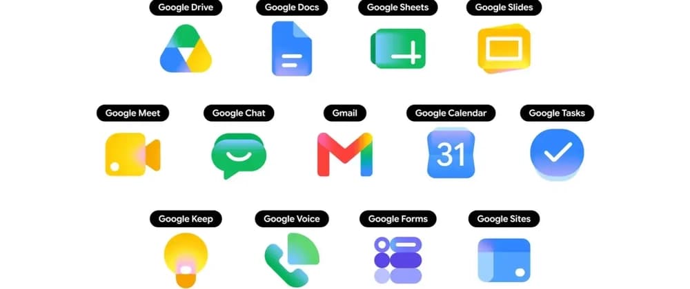
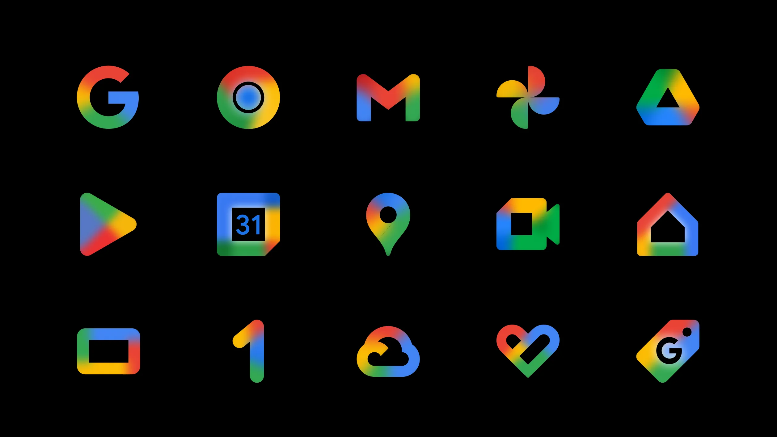
On May 18 Google started rolling out new gradient icons for thirteen of its Workspace apps. Gmail, Drive, Docs, Sheets, Slides, Calendar, Chat, Meet, Vids, Forms, Keep, Voice, and Tasks all got refreshed artwork on the web. The iOS and Android rollouts began this week.
https://thesvg.org/category/google-2026
If you build a SaaS dashboard with a "works with Google Workspace" row, or a marketing page that shows the Gmail icon next to your integration copy, you have a small problem. The icons in your codebase are now the old set, and most projects do not have a fast path to refresh them.
Here is what changed, why icon updates take so long to land in OSS libraries, and how to grab the new Google 2026 SVGs today without waiting.
TL;DR
| What | Status |
|---|---|
| Apps redesigned | 13 (Gmail, Drive, Docs, Sheets, Slides, Calendar, Chat, Meet, Vids, Forms, Keep, Voice, Tasks) |
| Visual direction | Gradient style, more distinct shape and color per app |
| Color rule change | Dropped the "all four Google colors" mandate |
| Gmail exception | Still uses more than one color, the only one in the set |
| Web rollout | Mid-May 2026 |
| Mobile rollout | Late May 2026 |
| OSS SVGs available at | thesvg.org/category/google-2026, free, no attribution |
1. What changed in the Google 2026 icon set
The earlier Google Workspace icons followed a strict rule. Every product icon had to use all four Google colors, blue, red, yellow, and green. The result was a row of icons that all looked vaguely similar at small sizes. A user in the app launcher would scan a wall of red-blue-yellow-green squares and pause to read the label.
The new direction drops that rule. Each app now leans on one or two dominant colors and a clearer shape, with a soft gradient finish. Gmail is the one holdout that still keeps more than one color, because the envelope is the recognizable shape and the colors are part of the brand identity.
The icons are also larger inside the same containing box. Most apps no longer ship the rounded-square page background, so the symbol takes up the full visual area instead of floating inside a card.
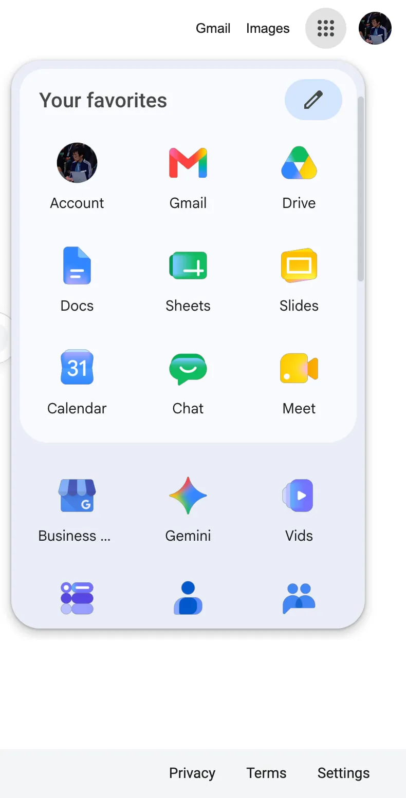
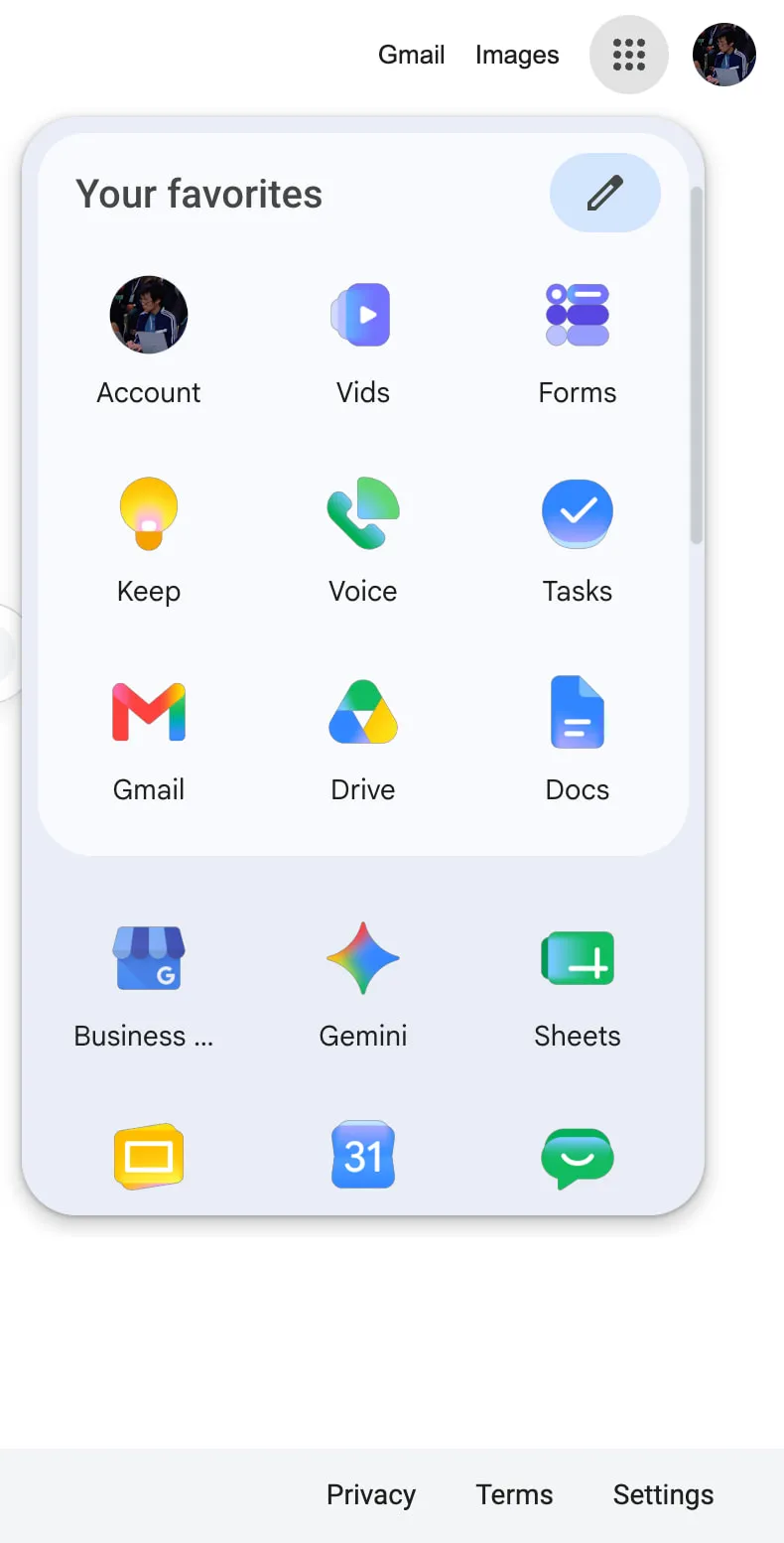
You can see the new Google 2026 icons in two places today, the app launcher in the top-right of any Google site, and the New Tab page in Chrome. Open either and you are already looking at the refreshed set, even if you have not touched any setting.
2. Why icon refreshes take time to reach your project
This is the part that bites a freelancer at 5pm on a Friday.
When a major brand refreshes its mark, the icon does not appear in your bundle on its own. Someone has to source the original from the brand's media kit or extract it from the live site. Then optimize the path through SVGO. Then verify it renders the same on dark and light backgrounds. Then categorize, name, and ship.
For a single brand refresh that touches one product, the cycle takes days to weeks depending on bandwidth. For thirteen apps in one rollout, multiply that. The OSS community absorbs brand refreshes one path file at a time, and most icon catalogs run on volunteer hours.
You get the gap. The official Google sites already show the new icons. Your app still shows the old ones. To a user who keeps Gmail open in a tab next to your dashboard, this reads as "this dashboard is stale." The icons are a small detail. Small details are what users read as signals of how current a product is.
https://github.com/GLINCKER/thesvg
3. Where to grab the Google 2026 SVGs today
The full Google 2026 icon set is live in the open-source library thesvg.org. All thirteen Workspace apps are in the catalog with the new gradient artwork, shipped the same week as Google's web rollout. License: free, no attribution required. The repo is on GitHub at GLINCKER/thesvg if you want to contribute, file an issue, or fork.
Install via npm:
npm install thesvg
Or download direct from the site. URLs follow a stable pattern, /icons/[brand]/[variant].svg, so you can wire them into a build step:
// src/components/GoogleIcon.tsx
// Server component or build-time loader, not a runtime fetch in production
import { readFileSync } from 'node:fs';
import { join } from 'node:path';

type IconName =
  | 'gmail' | 'google-drive' | 'google-docs'
  | 'google-sheets' | 'google-slides' | 'google-calendar'
  | 'google-chat' | 'google-meet' | 'google-vids'
  | 'google-forms' | 'google-keep' | 'google-voice'
  | 'google-tasks';

export function GoogleIcon({ name, size = 32 }: { name: IconName; size?: number }) {
  const svg = readFileSync(
    join(process.cwd(), 'public/icons', name, '2026.svg'),
    'utf-8',
  );
  return (
    <div
      style={{ width: size, height: size, display: 'inline-block' }}
      dangerouslySetInnerHTML={{ __html: svg }}
    />
  );
}
For a Vite or Next.js project, the cleaner path is to import the SVG as a component through your bundler's SVG loader. The above is the read-the-file version for projects that do not have a loader configured yet.
If you maintain an OSS app and need to migrate to the Google 2026 icons fast for a release this week, the path is: install the package, swap your existing Google icon imports for the 2026 variants, handle the Gmail edge case below, ship.
4. The Gmail multi-color edge case
One thing worth handling carefully in your render code. Gmail is the only app in the new Google 2026 set that keeps more than one color. The other twelve work fine with a currentColor fill or a single-color CSS override. Gmail breaks if you do that, because the multi-color fill is the brand.
If your design system applies a color prop to all logos uniformly, you need a special case for Gmail, or you ship two render paths:
function BrandIcon({ name, color }: { name: IconName; color?: string }) {
  const preservesColor = name === 'gmail';
  if (preservesColor) {
    return <GoogleIcon name={name} />;
  }
  return (
    <GoogleIcon name={name} style={{ color: color ?? 'currentColor' }} />
  );
}
This is the kind of edge case the old four-color rule used to hide. When every icon used four colors, you knew you could not apply a single-color override to any of them. Now twelve out of thirteen work fine with an override and one does not. Read your design system docs accordingly.
5. The bigger pattern
Brand refreshes ship faster than the icon ecosystem can absorb them. This is the third major refresh of the past two years where the official site updates on day zero and the broader OSS catalog catches up over weeks. When you depend on a third-party library to ship brand assets, you are accepting a built-in lag.
The fix is not to abandon icon libraries. The fix is to know which catalogs already have the assets you need for the release you are shipping this week, and to pick accordingly. For a marketing page going live now with a "works with Google" row, you want the catalog that already has the Google 2026 set. For a long-running design system, the audit trail and naming convention matter more than speed.
The OSS community is at its best when a new resource lands and people share it before everyone has to rebuild it from scratch. That is the spirit here.
The bottom line
Google shipped new gradient icons for thirteen Workspace apps on May 18. The web rollout is live, the mobile rollout is in progress, and the new SVGs are already available as OSS at thesvg.org/category/google-2026, free with no attribution. If you build product that lives next to Workspace in your users' tabs, the migration takes one afternoon.
What does your icon-refresh workflow look like when a major brand drops a redesign overnight? Drop a comment with your current setup.
GDS K S · thegdsks.com · building thesvg.org and Glincker · follow on X @thegdsks
Brand refreshes are the moment your icon library reveals whether it is curated or just convenient.